Error monitoring
Product design for an error monitoring tool built for small product teams: fewer charts, faster triage, and a straight line from a spike to the release that caused it.
- Client
- Error monitoring
- Year
- 2025
- Services
- Product design
- Scope
- Design and build
The brief
This is error monitoring for teams of five to fifty engineers, the ones who share an on-call rota and don't have a platform team. Their existing product captured everything and showed everything, and users told them the same thing in every interview: when something breaks, I can't find it.
The brief was to redesign the issues experience so an engineer woken up by an alert can go from the notification to the cause in under a minute.
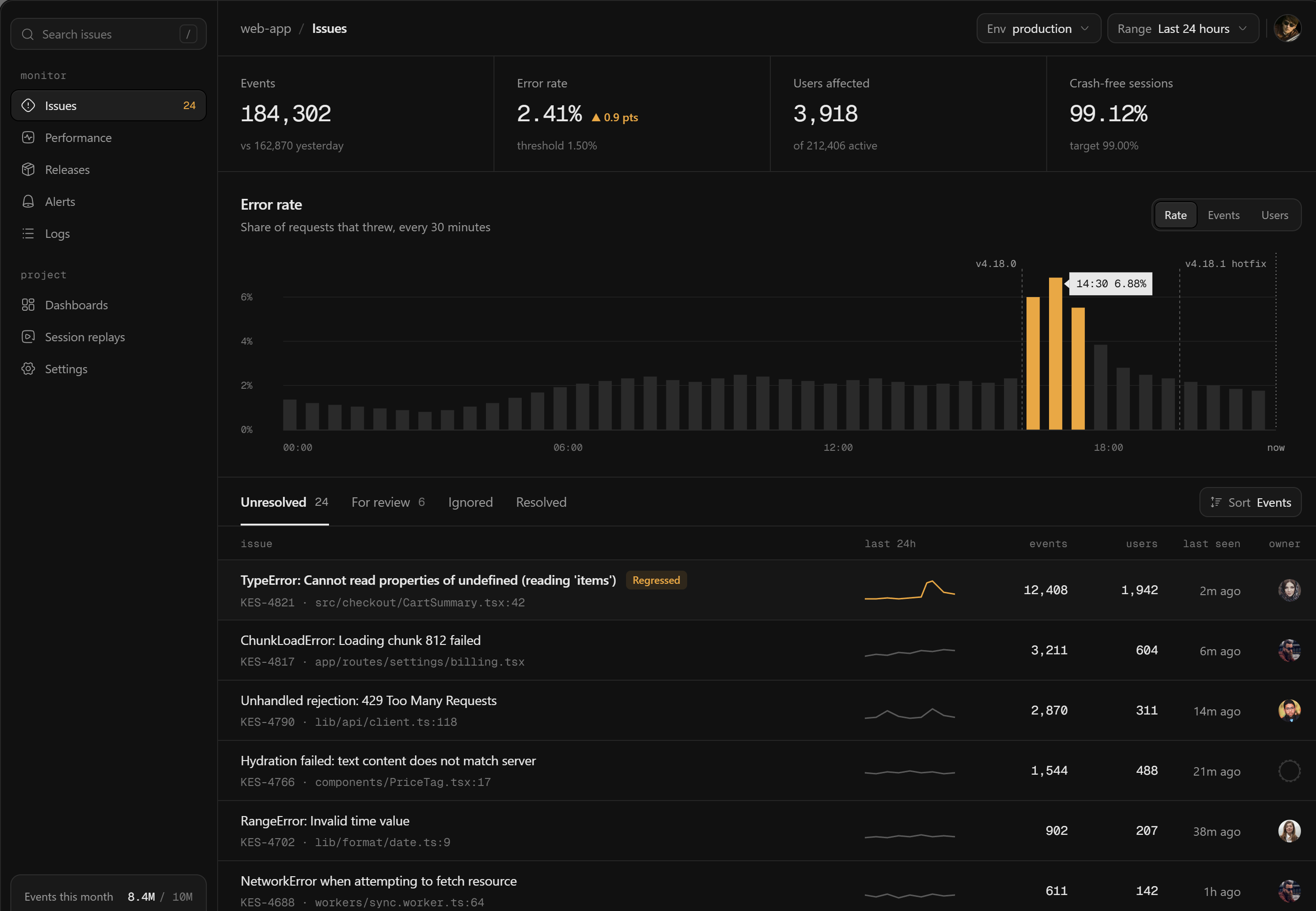
Issues overview. The chart and the list answer the same question from two sides.
Grey until it matters
Every bar in the error rate chart is the same quiet grey, except the ones above the threshold. Those turn amber, and nothing else on the screen uses that colour. A normal day looks like a flat grey band, and a bad one is obvious from across the desk.
Releases are drawn as dashed markers on the same axis, so the question 'did our deploy do this?' is answered by where the spike starts, not by opening a second tool.
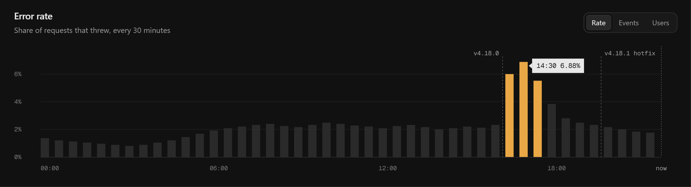
The spike starts right after v4.18.0 and settles after the hotfix. No legend needed.
An issue list you can scan half asleep
Each row puts the error in plain type first, then the ID and file path in mono underneath, so the eye separates what happened from where. A small sparkline shows whether it is new, steady or getting worse, and the columns that decide priority, events and users, sit together on the right.
The only tag in the list is 'Regressed', for an issue that was resolved and came back. It is the one state that always needs a person.
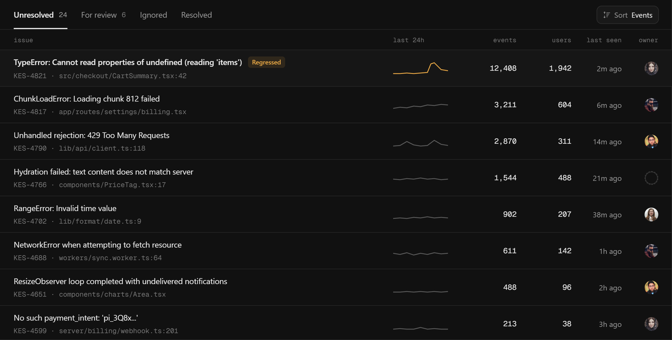
Titles in sans, paths and IDs in mono, one tag for the one state that needs a human.
Dark, but easy on the eyes
Developers asked for dark mode first, and they use it for hours at a time. Instead of pure black with bright white text we built a ladder of near-blacks one step apart, with text pulled down a notch. Surfaces separate by tone and hairlines, with no shadows at all.
What we delivered
The issues overview, issue detail with stack trace and session replay, alert rules and release views, all in one dark design system with a mono type layer for anything a developer might copy.
Next case study
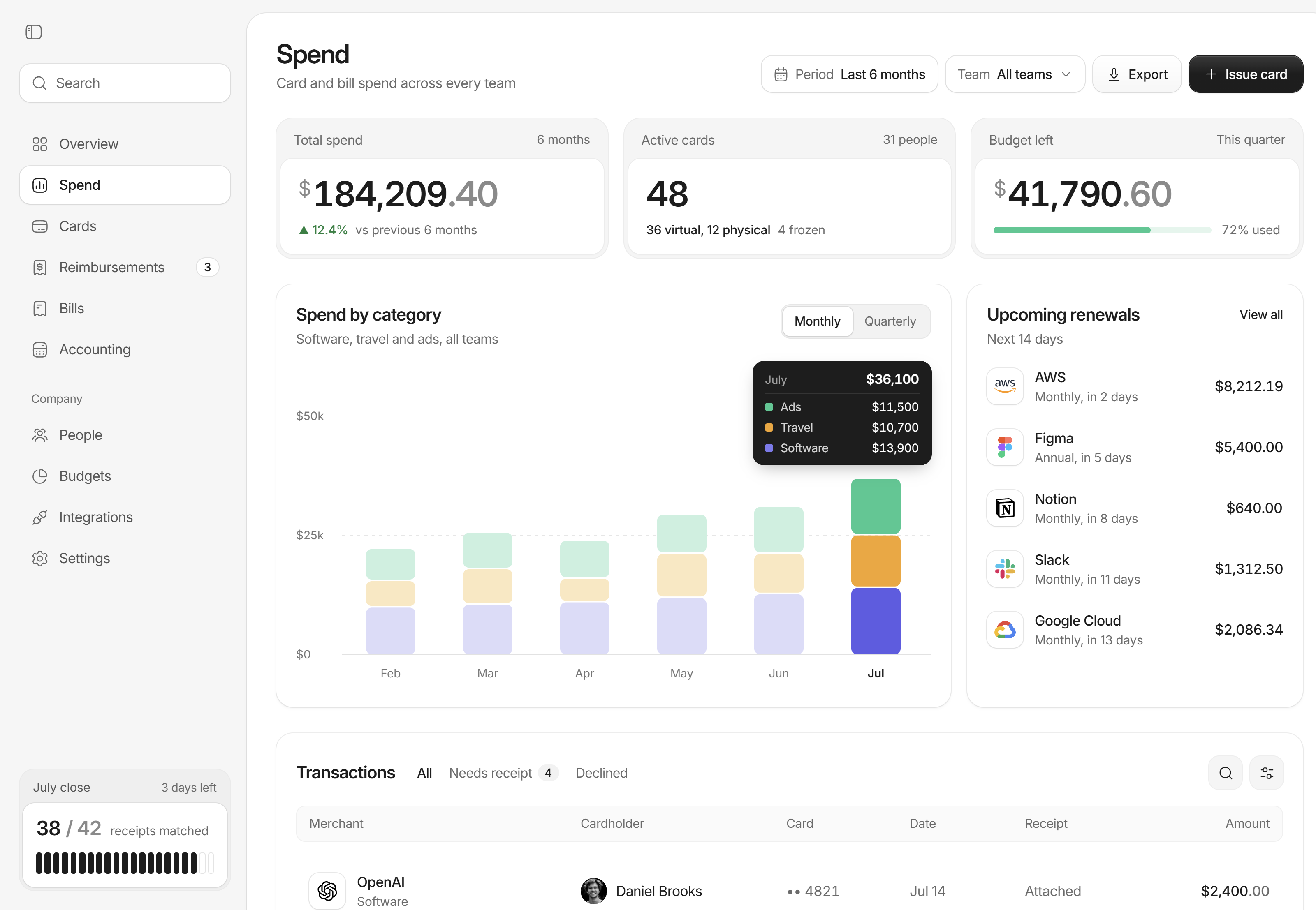
Spend management
Product design · 2026
Have a project like this?
Book a 20-minute call with Tyrese. You'll leave with a clear next step.