Invoicing Landing Page
A marketing site and pricing page for an invoicing tool made for freelancers and small studios, built to feel as calm as getting paid on time.
- Client
- Invoicing Landing Page
- Year
- 2026
- Services
- Website
- Scope
- Design and build
The brief
The client handles invoicing and payments for freelancers and small studios. Their product was good and their site looked like every other fintech: gradient blobs, a dashboard screenshot and a headline about 'the future of payments'.
They wanted a site their users would recognise themselves in. People who make things for clients, who hate chasing money, and who don't trust anything that looks like a bank.
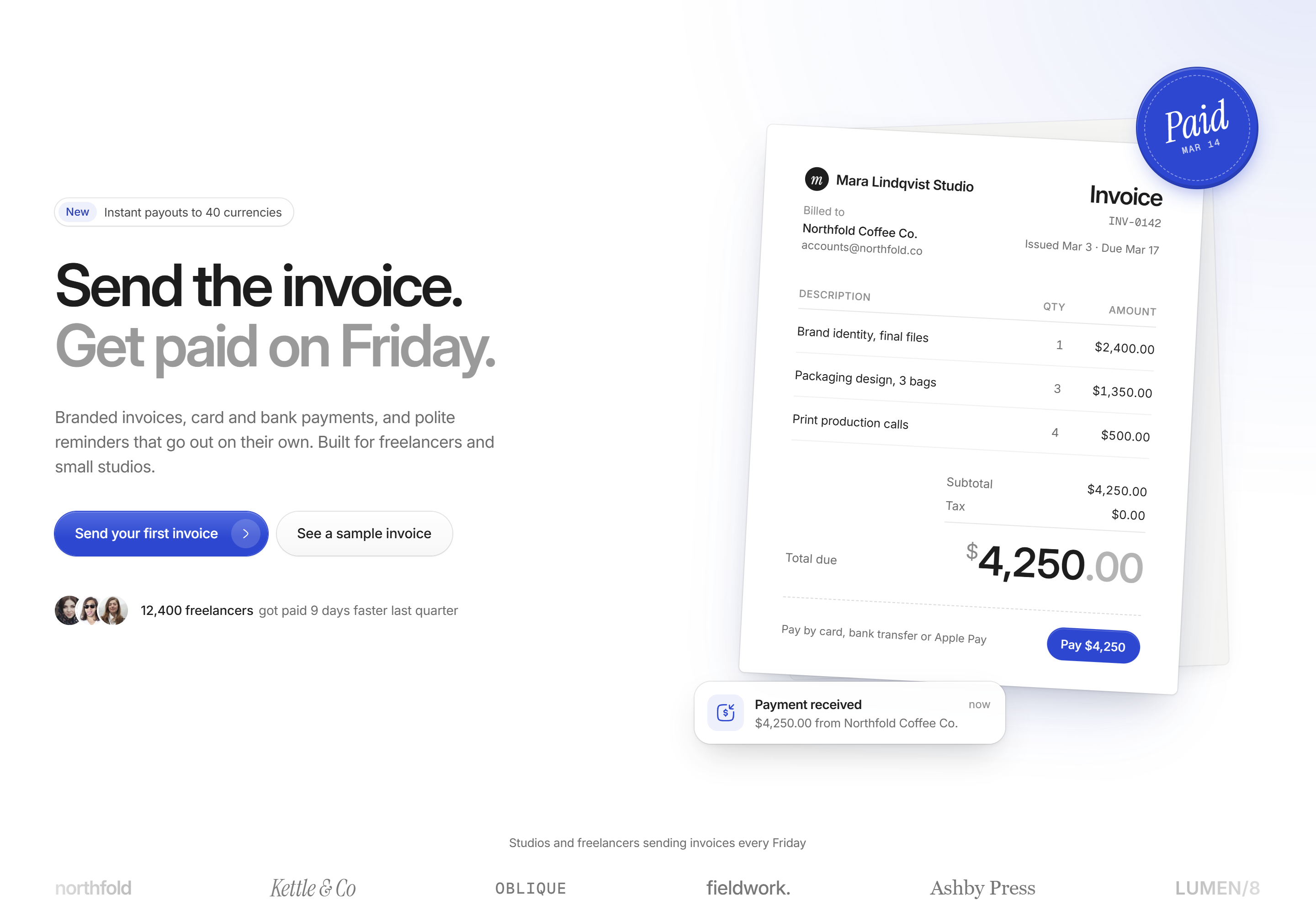
The homepage hero. The product shot is the thing customers actually send: an invoice.
Show the invoice, not the dashboard
Nobody buys invoicing software to look at a dashboard. They buy it so an invoice goes out and money comes back. So the hero is a paper invoice, slightly tilted, with a 'Paid' stamp on the corner and a payment notification underneath.
The headline does the same job in words. 'Send the invoice.' in black, 'Get paid on Friday.' fading out beneath it. One promise, no feature list.
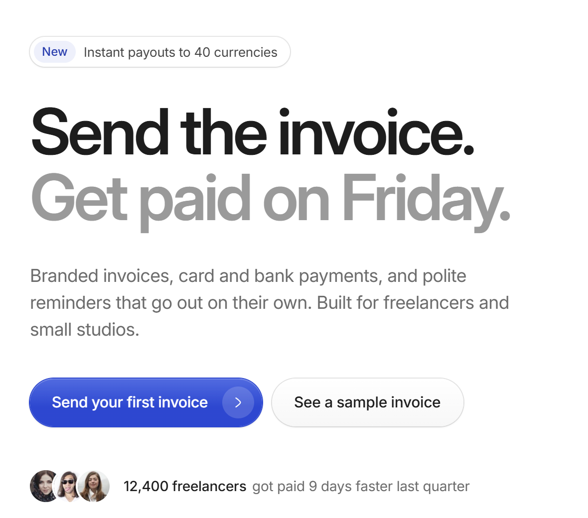
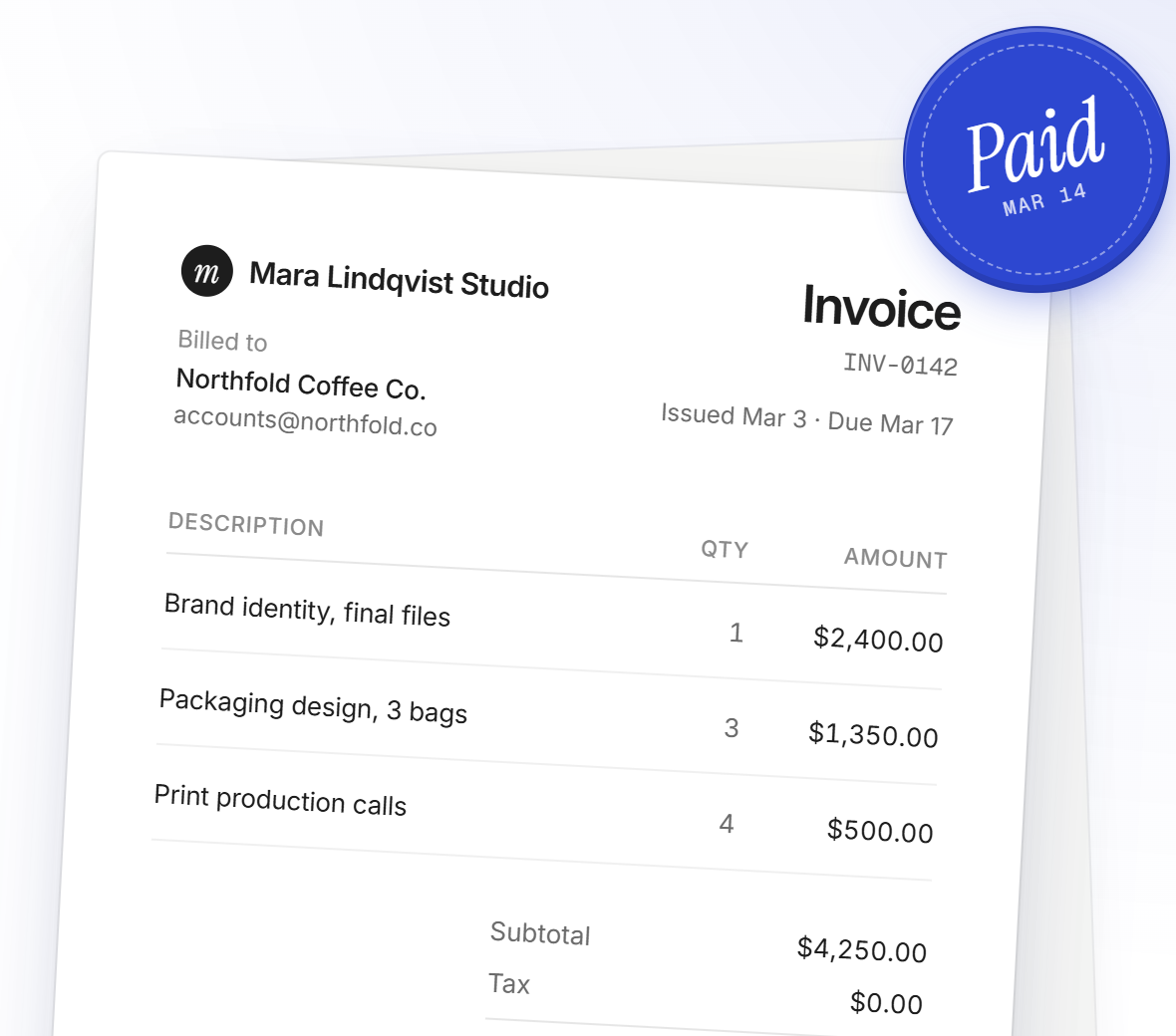
The headline and the object it describes, side by side.
Pricing that doesn't make you do maths
Three plans, named after who they are for rather than how big they are. The price is set about three times the size of '/mo' so it reads first, and the annual toggle says what you save instead of showing a percentage.
The recommended plan gets a tucked strip under its card with the one fact that sells it. Everything else lives in a plain comparison table below, for people who want the detail.
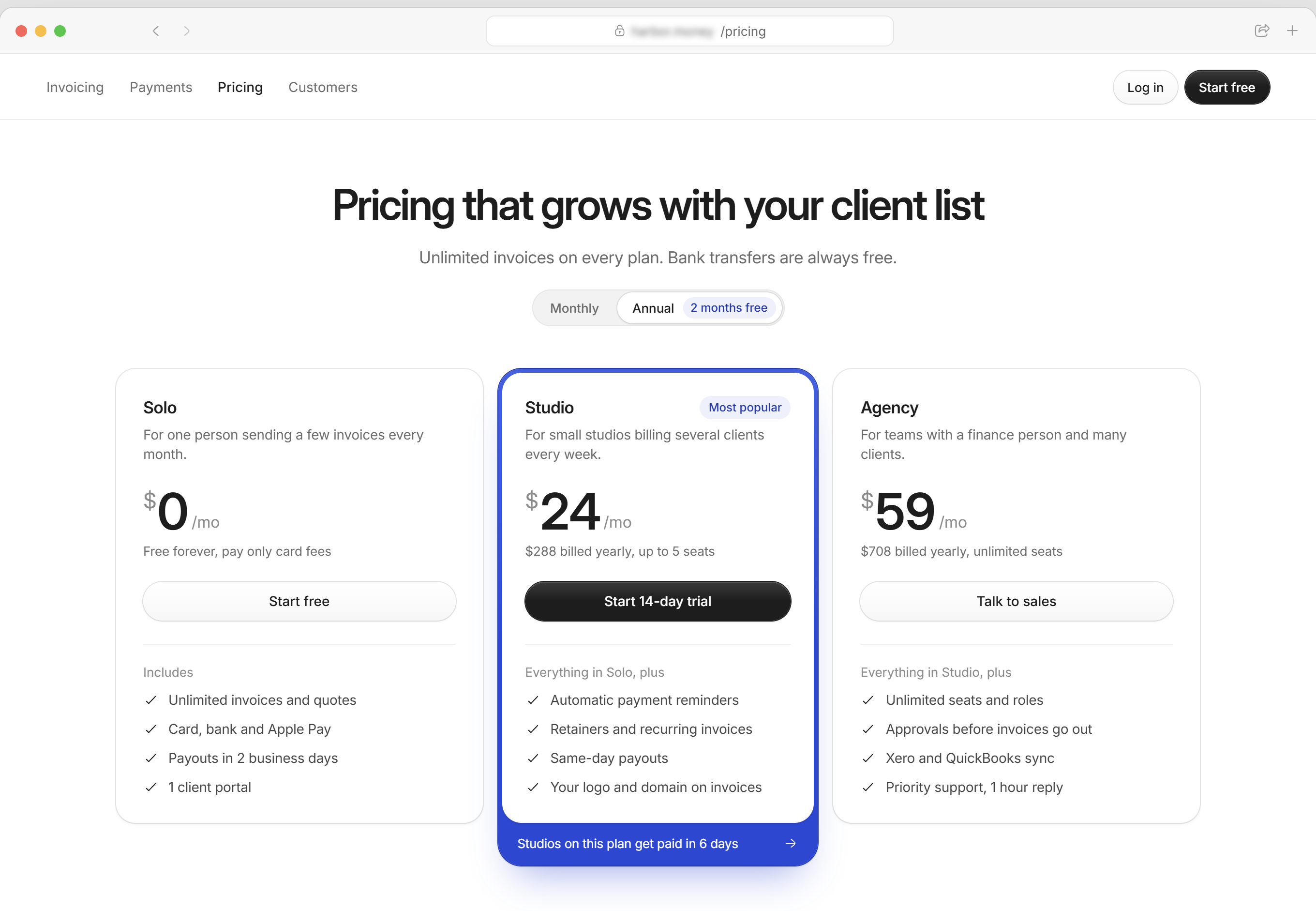
Pricing, with the recommended plan lifted and a comparison table underneath.
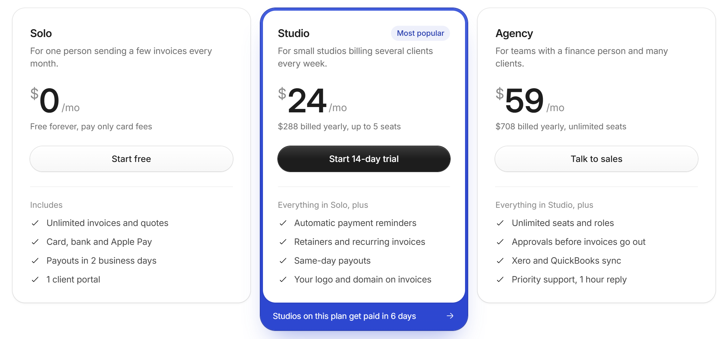
Plan names describe the customer, not the tier.
Next case study
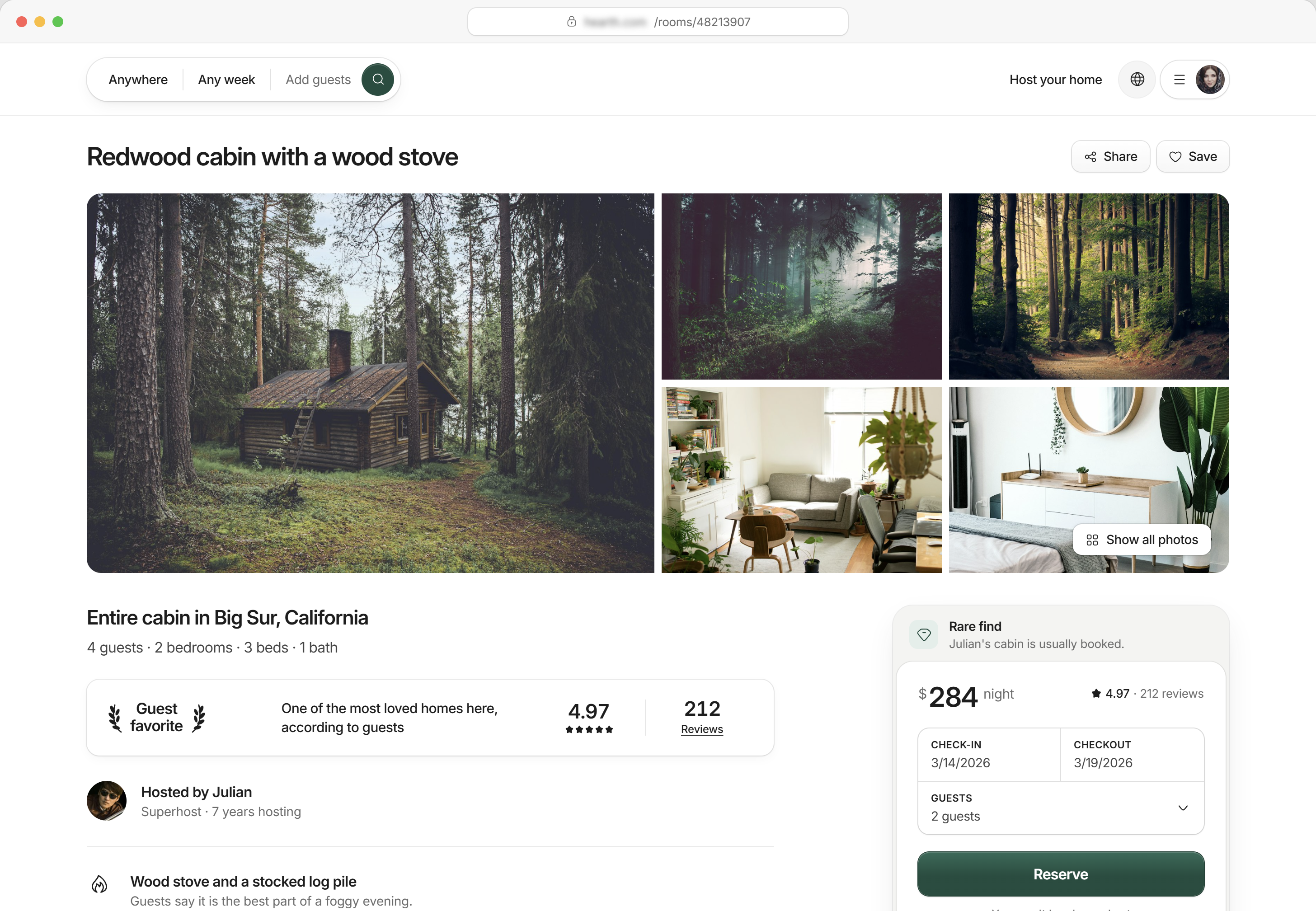
Stays Booking
Product design · 2026
Have a project like this?
Book a 20-minute call with Tyrese. You'll leave with a clear next step.