Store Concept
A self-initiated concept: a commerce admin redesigned around what a store owner has to do today, with calmer order states and designed numbers.
- Client
- Store Concept
- Year
- 2026
- Services
- Product design
- Scope
- Design and build
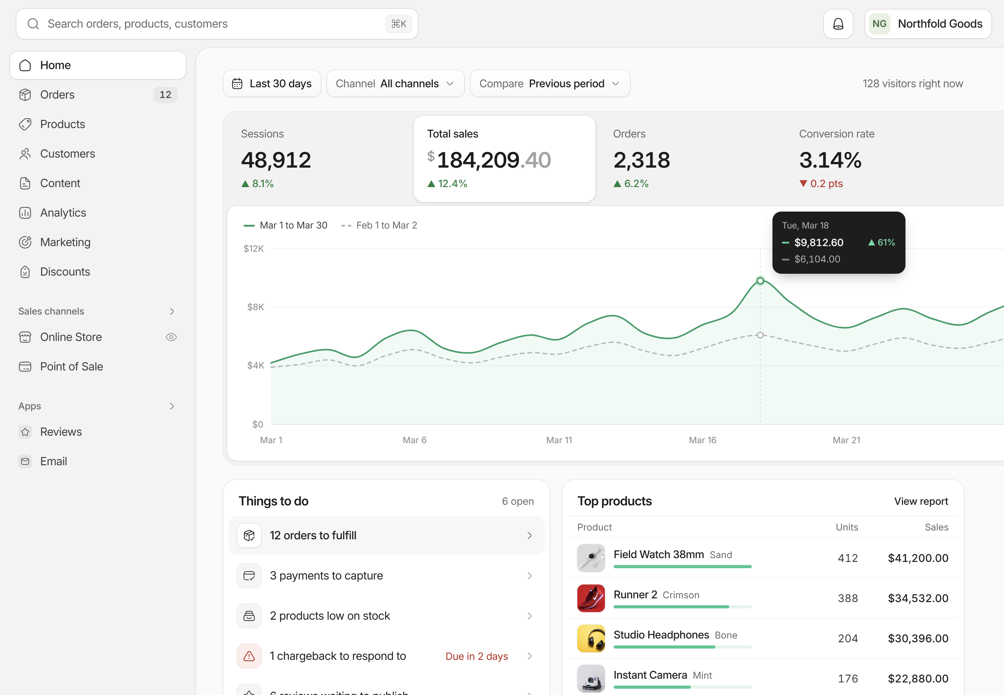
About this concept
This is a mockup, not client work. We took the admin of a well-known commerce platform, kept its navigation and page structure, and redesigned it with our system to see what a calmer version would feel like for a small store owner.
Home. Sales at the top, then the things that need doing today.
The metric you click drives the chart
Sessions, sales, orders and conversion sit as four cells in one strip. The selected cell lifts onto a white card and drives the chart below, with the comparison period dashed and grey behind it. The money figure gets a raised dollar sign and grey cents, and nothing else does.
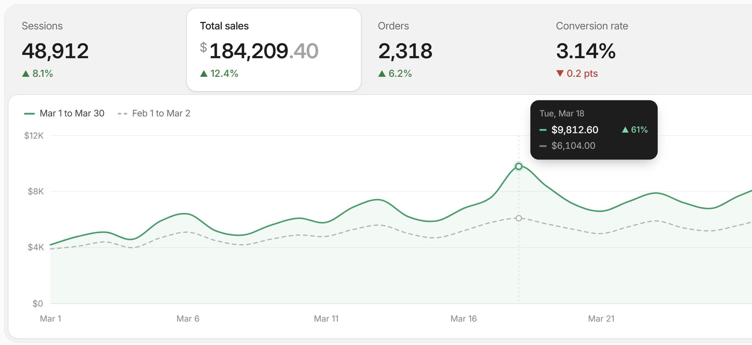
Total sales selected, with the previous period dashed behind it.
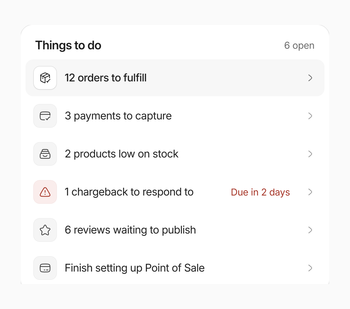
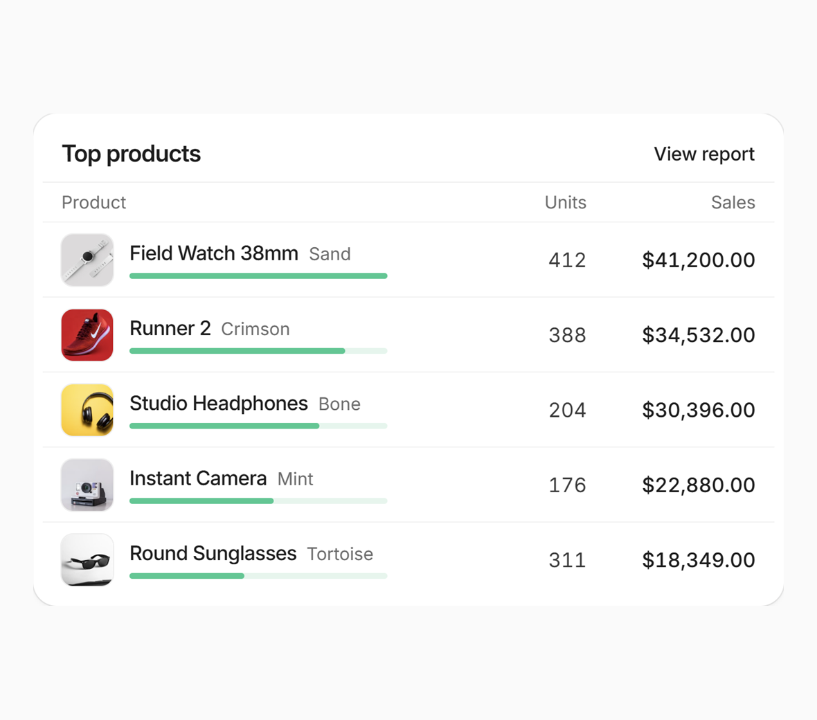
A to-do list where only the chargeback is coloured, and top products with a share bar per row.
Order states that only speak up when needed
Most commerce admins colour every status, so a table of healthy orders looks like an alarm. Here paid and fulfilled are plain grey text. Only unfulfilled and payment pending get an amber tint, because those are the orders someone has to act on.
Selecting an order opens a preview card with the products, the total and a single 'Fulfill items' action, so most orders never need their own page.
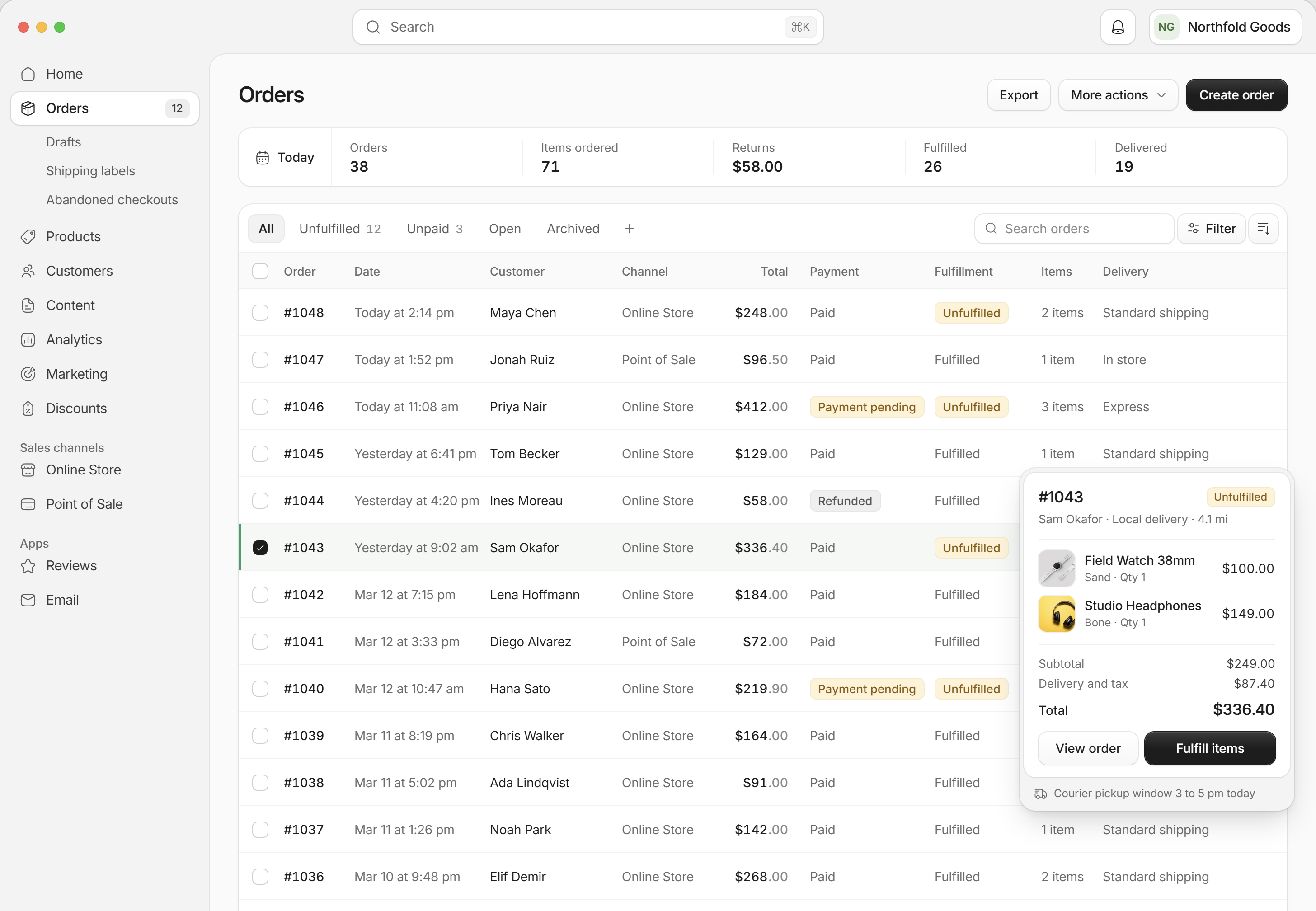
Orders, with one order open in a preview card.
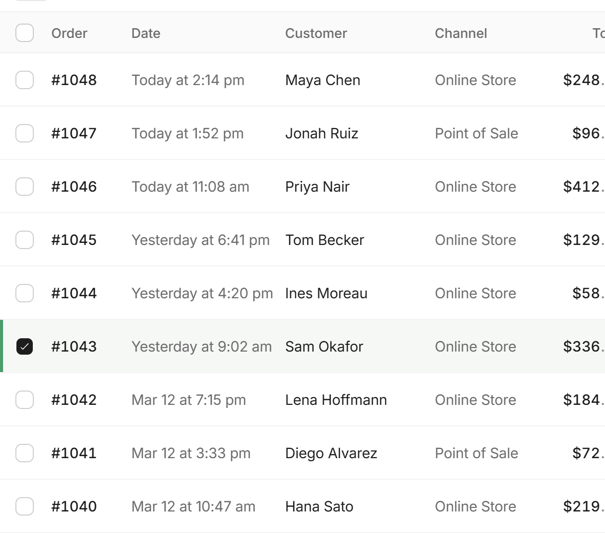
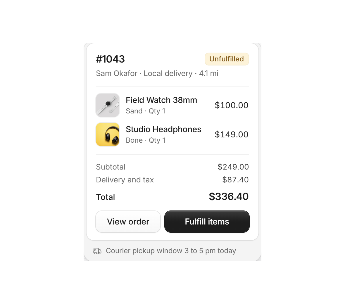
Only the states that need action are tinted.
Next case study

Rivo
Website · 2026
Have a project like this?
Book a 20-minute call with Tyrese. You'll leave with a clear next step.